Kahevo's pages take on the colors of the sea: open ocean by night, the shoreline by day.
Kahevo's pages have a new look, borrowed from the app.
The sea, in two lights
Dark mode is the open sea off the islands: sunlit near the surface, deep and nearly black below, with reef turquoise for whatever is switched on or selected.
Light mode is the shore: warm sand running into shallow water, with deep lagoon blue as the accent. Text is the navy of the dark mode's water, not black.
Hanging up is the red of ʻōhiʻa lehua, the one color on the page that means stop.
Three years of the same page
It is worth seeing how far the pages had come before this.
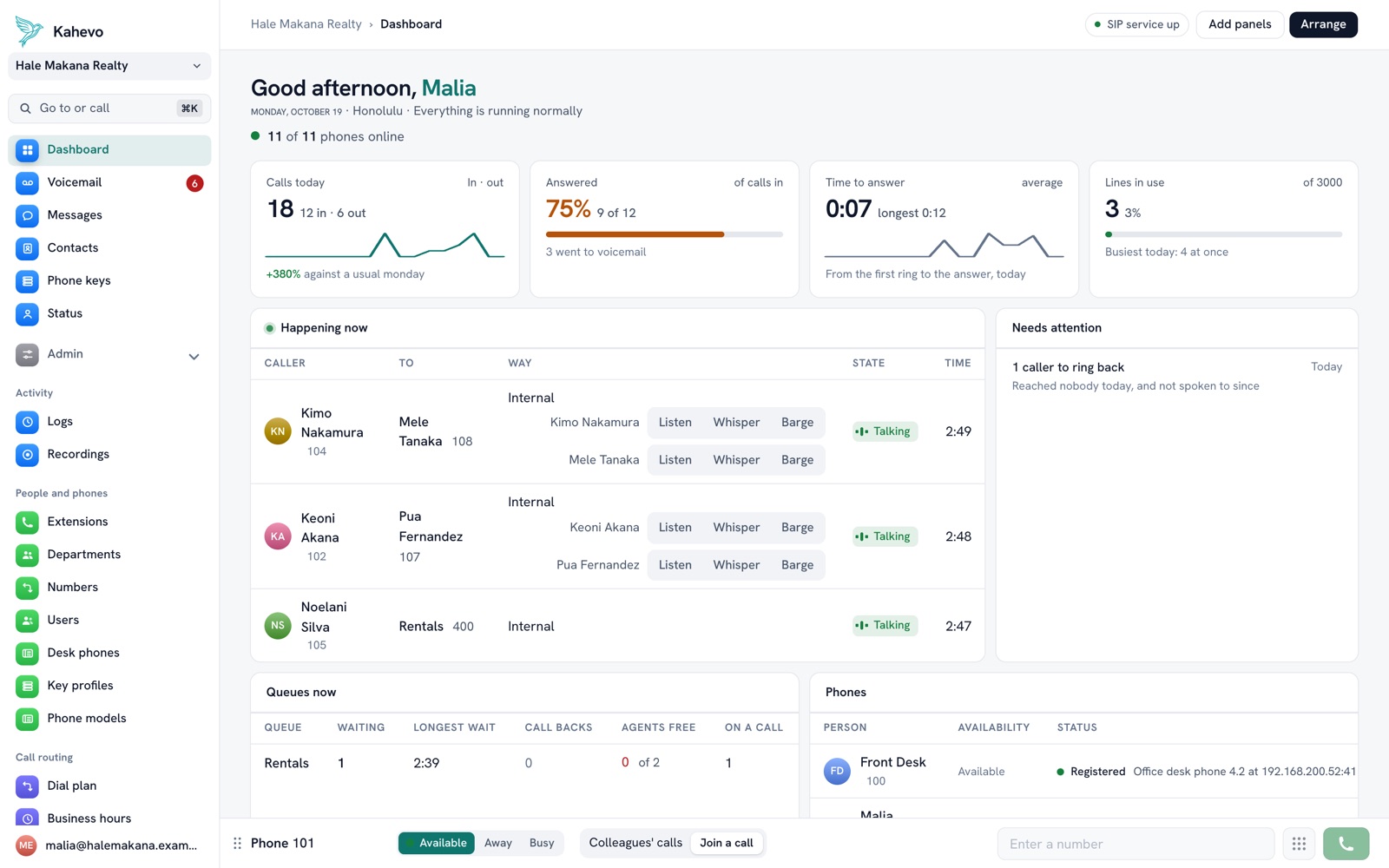
Same idea every time: show what is true, and get out of the way. It just took a few tries to make it pleasant.
One look everywhere
The website and the app now share a single set of colors. Switch from one to the other and you have not gone anywhere.
More than paint
A few things changed at the same time, all from watching people use it:
- Pages use the whole width of the window. Wide monitors are common and the old narrow column wasted them.
- Long pages are split into tabs instead of making you scroll.
- The admin pages are listed by name in the sidebar under plain headings: people and phones, call routing, sounds, system.
- Buttons and forms sit in the same place on every page, so nothing has to be looked for.
Fast, on purpose
We tried animated transitions between pages. They looked lovely in a demo and felt slow by the twentieth click, so they are gone. Changing page is now a quick fade and nothing else.
Still a phone system
It is still a phone system. It is just nicer to look at while you are on hold with someone else's.